
Once again research lead to a surprising nuance which ultimately lead to the subject of this ad, Dill Pickles. Mae West was a fascinating character of stage and screen from 1911 to 1978. So, what does this have to do with dill pickles? Turns out she starred in her own play at the Dill Pickles club in Chicago. Boom!
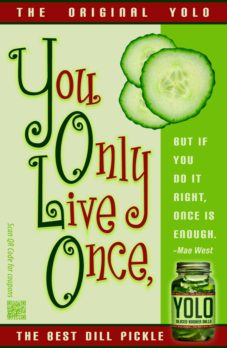
This magazine ad has a nice grid structure with colors that are inspired by premium dill pickles, except for the red which I chose because of its contrast to the other colors. The typography of the ad is the highlight of its content. You can notice that each of the capital letters have one small swirl, and one large swirl, and they are tied together via color. The n’s, u’s and y’s are all the same letterforms with slight changes, as are the c’s and e’s. Since the main focus typography was a serif font, I used a sans-serif for the rest of the ad. I designed the pickle jar in the corner as well.
This magazine ad has a nice grid structure with colors that are inspired by premium dill pickles, except for the red which I chose because of its contrast to the other colors. The typography of the ad is the highlight of its content. You can notice that each of the capital letters have one small swirl, and one large swirl, and they are tied together via color. The n’s, u’s and y’s are all the same letterforms with slight changes, as are the c’s and e’s. Since the main focus typography was a serif font, I used a sans-serif for the rest of the ad. I designed the pickle jar in the corner as well.


