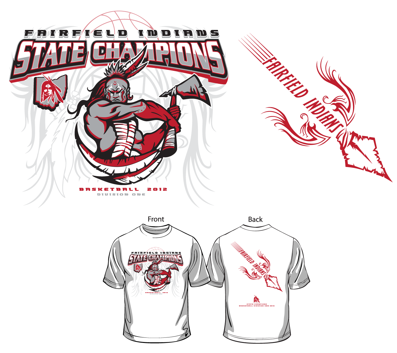

Anyone who has worked for screen printing shops know how poorly executed a typical screen-printing set of clip art images can be, and this was definitely the case when the owner of the print shop came to the office with such a collection of images back in 2012. That doesn’t mean that someone with good design skills can’t make stunning designs out of them. In much the same way a famous guitarist can make great music on a Hello Kitty Guitar (look it up on YouTube, trust me) I tried to make great designs using crappy clip art. It’s not just the tool, it’s the way you use it.
Here, I combined a number of clipart images and augmented them using color and shadow to make a fierce design to celebrate their victory during the tournament. I really love the sense of motion the back design has, like a spear or arrow flying to hit its target. I also like how the treatment of the type on the front reflects the foreshortening of the character and his tomahawk.
Here, I combined a number of clipart images and augmented them using color and shadow to make a fierce design to celebrate their victory during the tournament. I really love the sense of motion the back design has, like a spear or arrow flying to hit its target. I also like how the treatment of the type on the front reflects the foreshortening of the character and his tomahawk.
