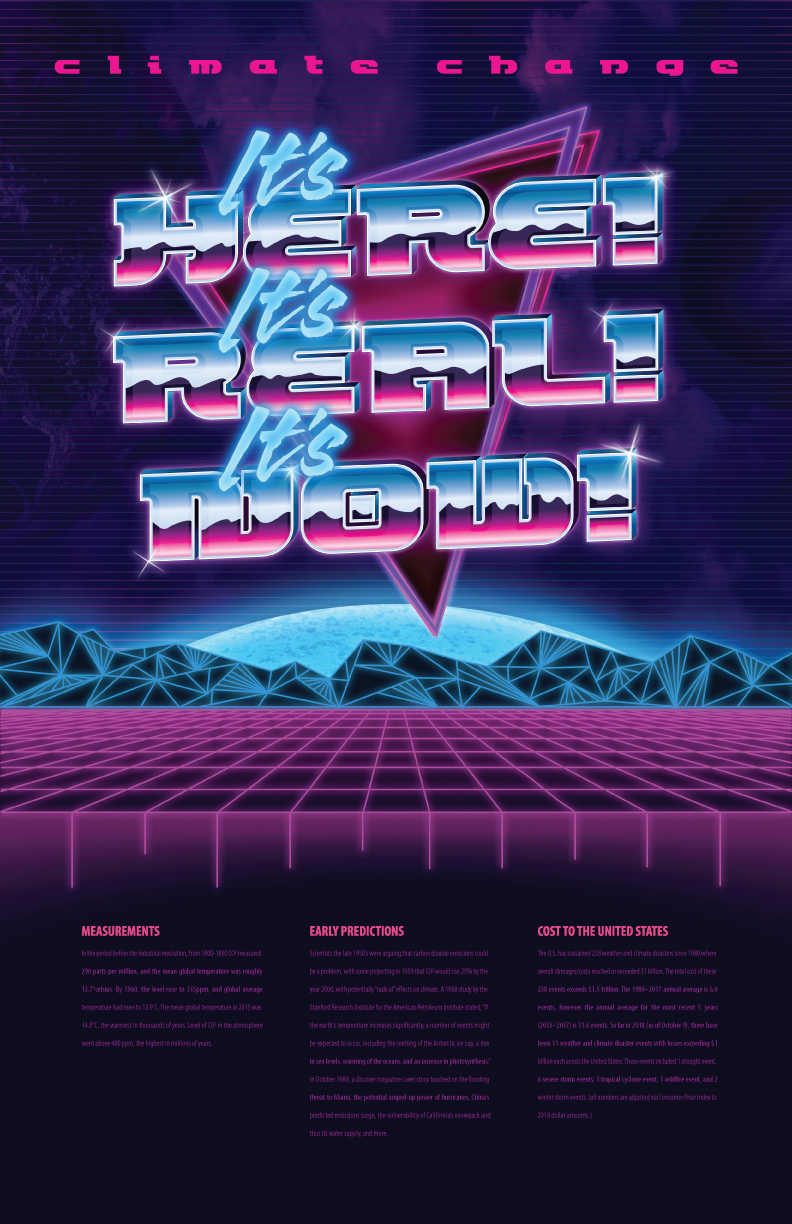

I love the 80’s retro style of this design for Green Patriot posters. The real point here is to grab a person’s attention and make them want to stop walking down the hall and read the information on the bottom of the poster, instead of passing by without a second glance.
As usual, the research on the subject matter helped to steer me in this direction. Turns out a lot of studies and early predictions were wide spread during the late seventies and into the eighties. After the decision was made on the style of the images, I conducted visual research to make sure I really nailed the style. Before I laid down any color, the “Here Real and Now” font I chose was augmented and changed to make it look great in just solid black and white.
I love the 80’s retro style of this design for Green Patriot posters. As usual, the research on the subject matter helped to steer me in this direction. Turns out a lot of studies and early predictions were wide spread during the late seventies and into the eighties. After the decision was made on the style of the images, I conducted visual research to make sure I really nailed the style.


