


What’s a portfolio site without a good propaganda poster, am I right?
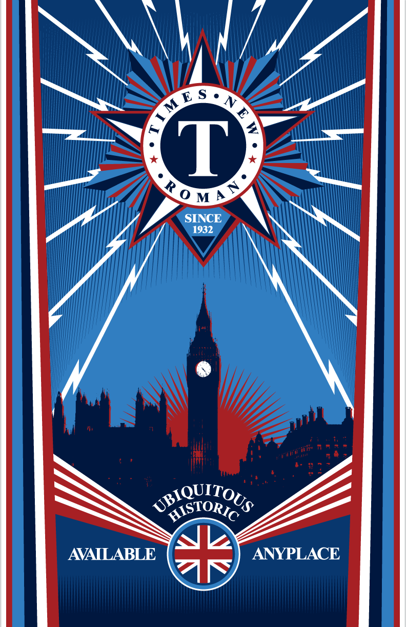
This poster was part one of a two-part project for which I did historical research on the font, Times New Roman. Turns out the font has an interesting history starting back in 1929 when the London newspaper The Times hired typographer Stanley Morison of Monotype to create a new text font for the paper. I did further research to see what kind of art was popular at the time and turns out there were a lot of propaganda posters about. So, I went in that direction.
Visual research into propaganda posters revealed certain elements each poster had, and several are represented in what I designed including: Swaths of solid colors, lots of angular elements, using geometric shapes to act in place of gradients, and short concise messaging. The colors I chose are representative of the British flag.
This poster was part one of a two-part project for which I did historical research on the font, Times New Roman. Turns out the font has an interesting history starting back in 1929 when the London newspaper The Times hired typographer Stanley Morison of Monotype to create a new text font for the paper. Visual research into propaganda posters revealed certain elements each poster had, and several are represented in what I designed including: Swaths of solid colors, lots of angular elements, using geometric shapes to act in place of gradients, and short concise messaging. The colors I chose are representative of the British flag.