
I’m a big fan of Typography, and because of this I really like coming up with unique typographic treatments resulting in cool logos for companies, causes and events alike.
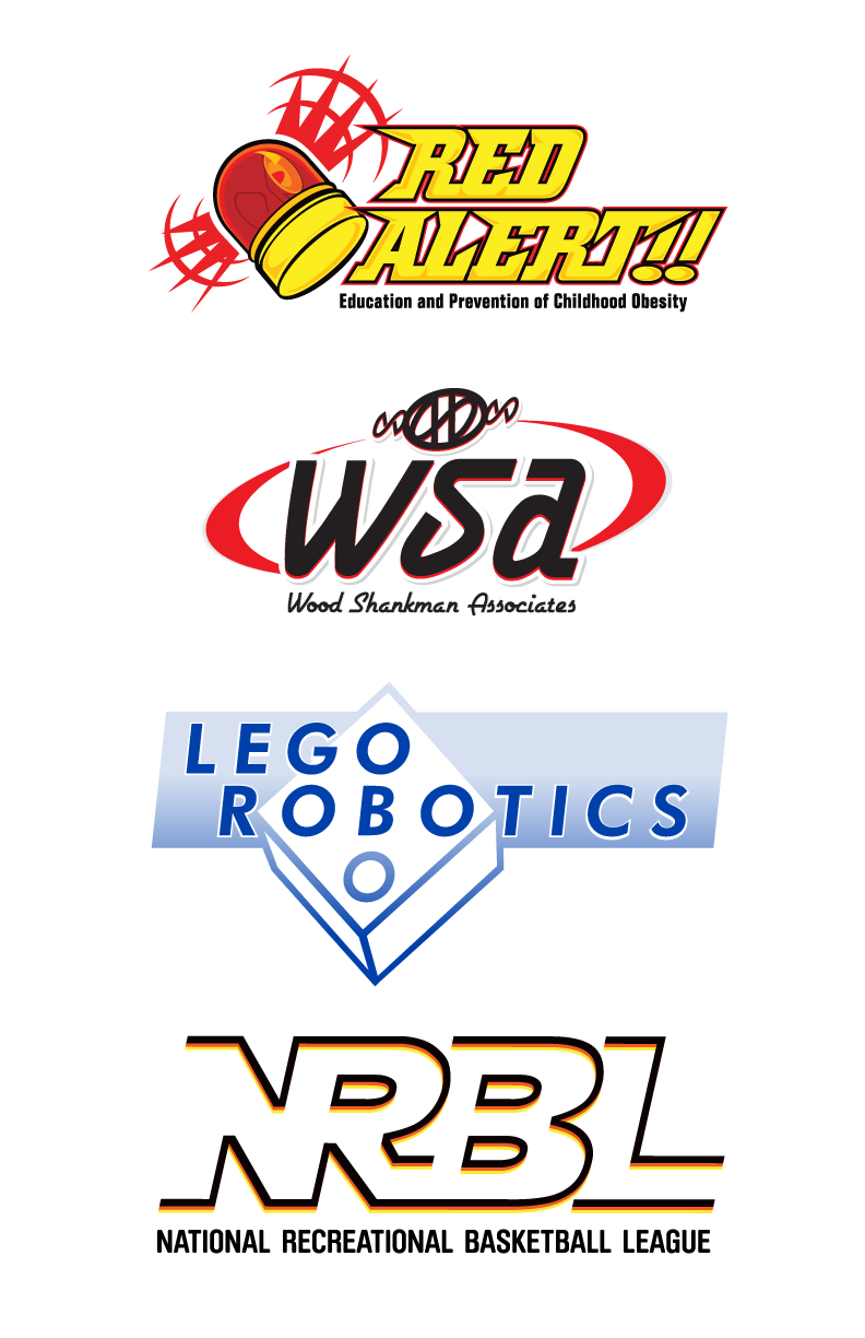
Red Alert: This logo has both children and parents in mind, and so it needed to grab the attention of both. This entity is fully of my own creation and resulted from research into the health crises of childhood obesity.
Wood Shankman Associates: Here the client, a company providing service to the confectionery, snack, and food industries and specializing in candy amongst other industries, needed an updated logo for its employees in their candy division. After I made changes to the font in the logo, I made the candy piece out of parts of the type.
Lego Robotics: I designed this so you can go between reading, “Lego Robotics,” and seeing the classic Lego block in the same one-color design.
NRBL: Here the letterforms flow through and between one another. The eyes of the R and B are made with the same shape. Finally, the black, orange, and yellow reflect the ridges of an actual basketball.
Red Alert: This logo has both children and parents in mind, and so it needed to grab the attention of both. This entity is fully of my own creation and resulted from research into the health crises of childhood obesity.
Wood Shankman Associates: Here the client, a company providing service to the confectionery, snack, and food industries and specializing in candy amongst other industries, needed an updated logo for its employees in their candy division.
Lego Robotics: I designed this so you can go between reading, “Lego Robotics,” and seeing the classic Lego block in the same one-color design.
NRBL: Here the letterforms flow through and between one another. The black, orange, and yellow reflect the ridges of an actual basketball.