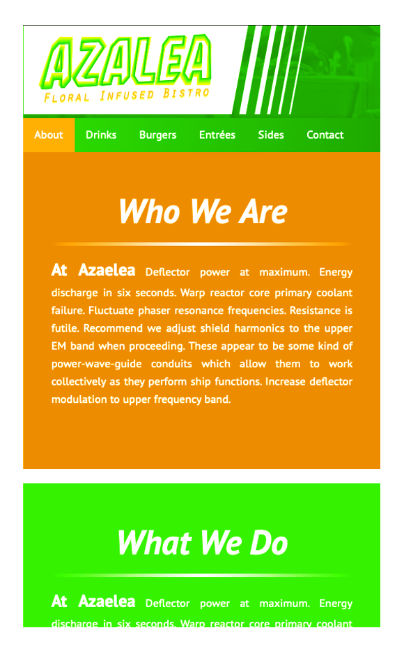

Azalea is the second fully responsive site I designed while attending Cincinnati State, and is by far my favorite. I really like how the greens, oranges, and yellows play off one another so vibrantly. I designed the logo for the company, and the colors I used reminds me of flowers and Spring.
To visit the site TAP HERE.


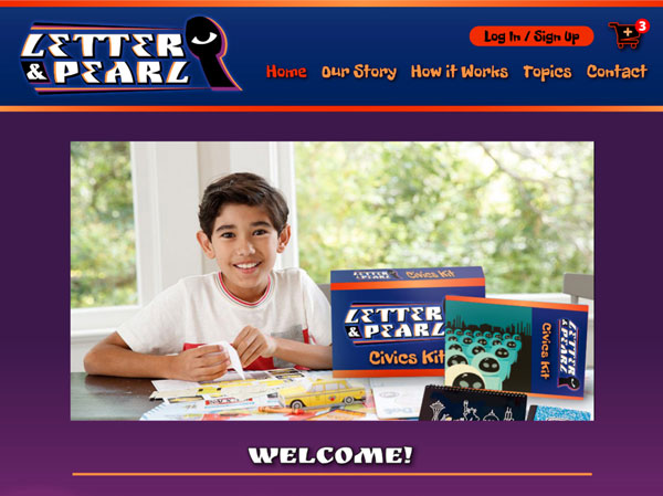
This is the result of a semester long study in Usability Design where we conducted user testing on everything from our logos to our checkout process. We even tested for colorblindness! This was put together using Adobe XD and optimized for tablets. The XD window is very small on phones, but you can see mobile-like mockup by TAPPING HERE.