
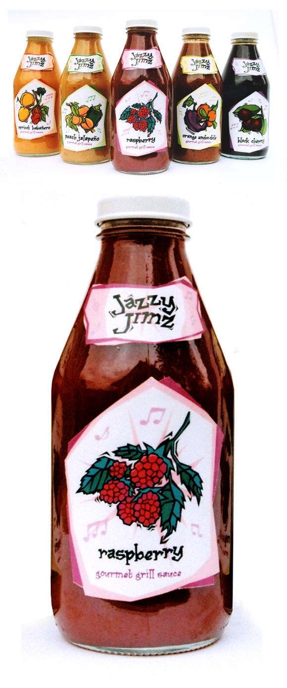
Here, all illustrational, graphic, and typographic output is of my own creation. I also researched the recipes for the ingredients and found condiments that looked like what the bottles would contain had they actually to gone into production. I photographed the bottles myself.

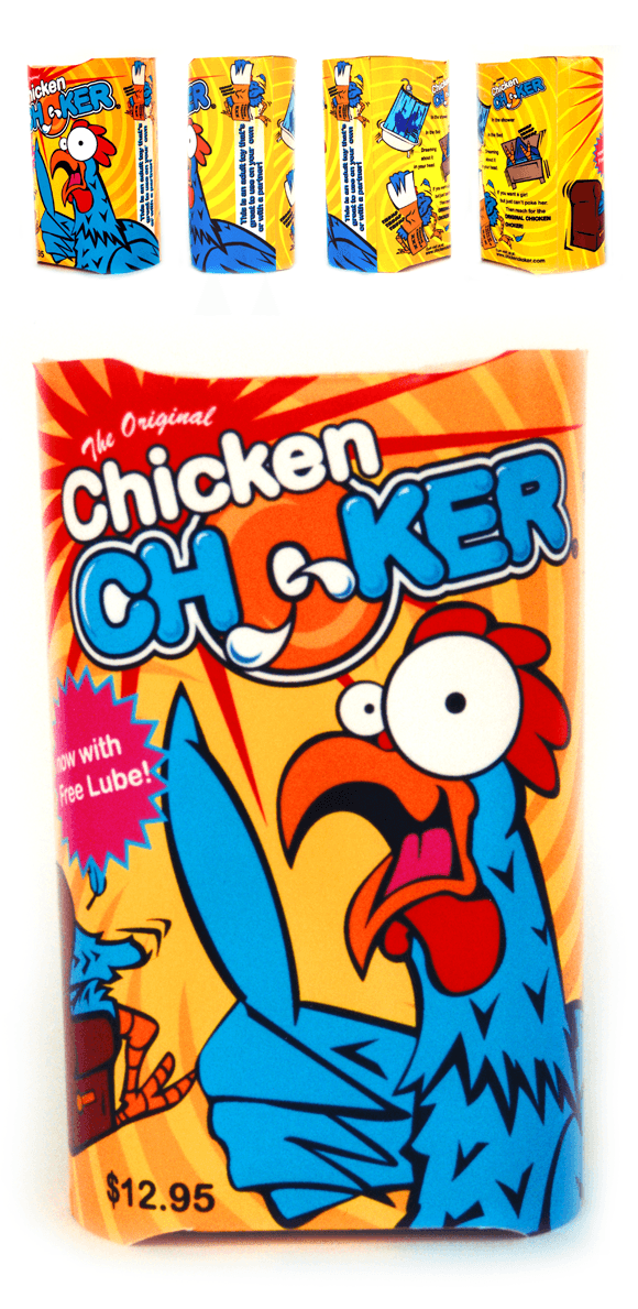
I really love package design. I enjoy the three-dimensionality of the discipline, and the way designing packages encompasses so many aspects of the design process: Logo development, illustration, layout and so on. This particular design involves a funny chicken character I illustrated myself.

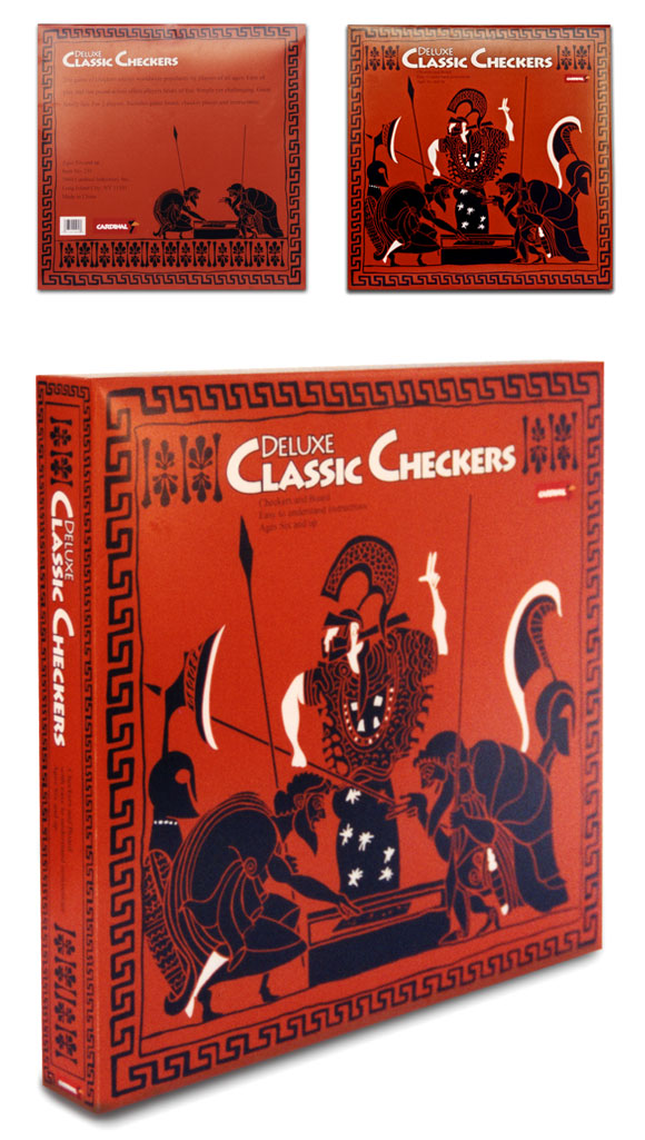
I always feel that researching the topic for which you are designing has the potential to lead you to surprising outcomes. In this case, it turns out that games like checkers have been played for thousands of years. Using ancient Greek vase art as a basis for my illustrations, I created this stunningly detailed checkers set.

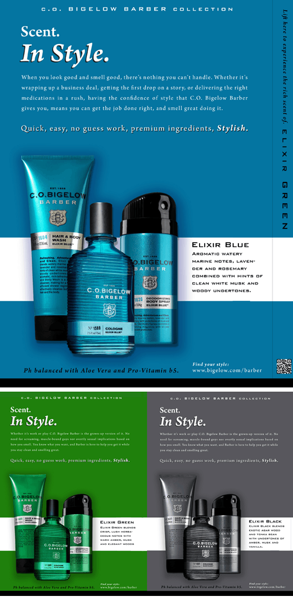
I researched the low and high ends of the men’s fragrance and body wash market, engaged in demographic breakdowns for age, gender, income, marital status, geographic segmentation, technology use, and sense of fashion. The products were already on the market, so I did not design the packaging. I did, however, design all the promotional materials, including these magazine ads.

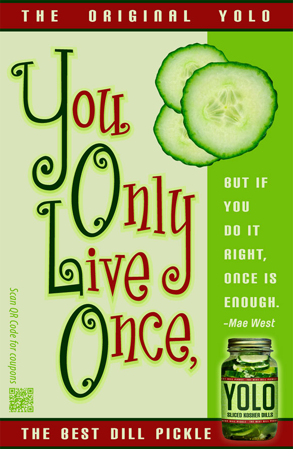
This magazine ad has a nice grid structure with colors that are inspired by premium dill pickles, except for the red which I chose because of its contrast to the other colors. The typography of the ad is the highlight of its content.

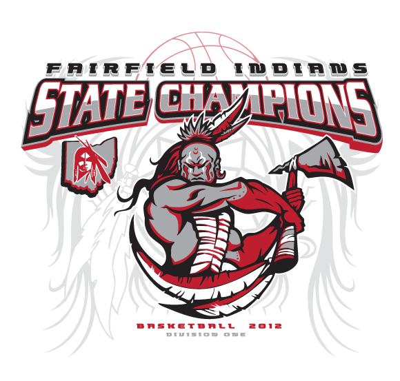
For the Fairfield Indians Basketball Championship tee shirt, I combined a number of clipart images and augmented them using color and shadow to make a fierce design to celebrate their victory during the championship tournament. This is the front imprint of the shirt design.

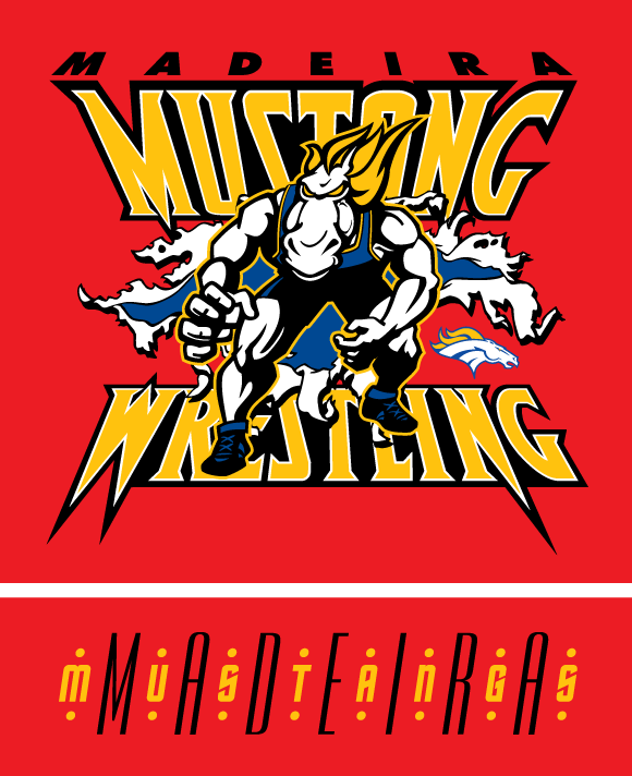
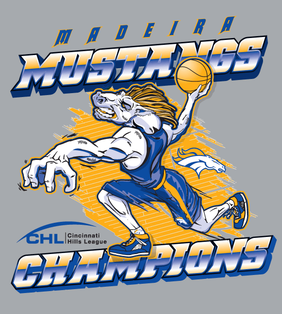
This is one of my all-time favorite t-shirts I’ve designed. I just love the retro, hot-wheels kind of feel this design has. The typographic elements of this design are of my own creation, including the cool Madeira Mustang combo-type on the back of the tee.

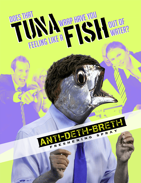
A literal take on the phrase, “Like a fish out of water,” this ad for a breath spray of my own creation uses many tools in the Photoshop tool box. Grabbing images of tuna, I used several warping filters including Liquify and Puppet Warp to bend and shape those images to create a frowning, shocked fish. This is a really funny ad!

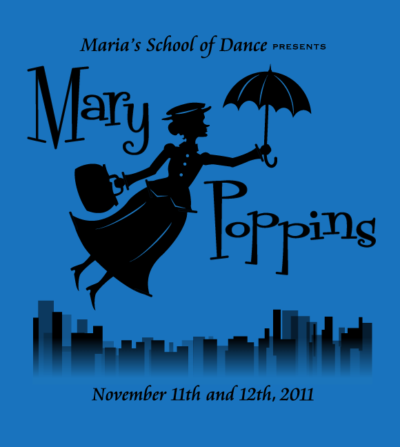
This particular character design was inspired from a wrought iron garden decoration. I found a playful font and made a logotype using the letterforms, changing them to suit my purposes. Lastly, to tie it all together, I took the serifs from the font and used them as accents on Mary’s dress.

For this championship shirt, I combined several clip art images and augmented them using my illustrational skills, giving the art changes of color, and adding visual depth. Because this is a screen-printed image, I set halftones and used transpar-encies to maximize the impact of this four-color design.

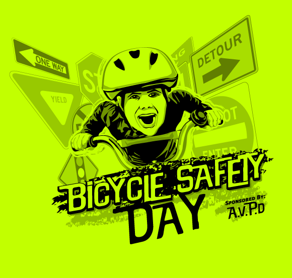
This shirt design was commissioned by the Amberley Village police department. They held a bicycle safety event, complete with an obstacle course for children in the neighborhood and the department wanted a way to promote and celebrate the event. This shirt sold out twice do to its popularity.

I’m a big fan of Typography, and because of this I really like coming up with unique typographic treatments resulting in cool logos for companies, causes and events alike. If you would like to see a detailed description for each logo, please check out the desktop site.

Did I mention that I’m a big fan of Typography? I usually start the process of coming up with logos by first exploring different fonts that portray certain feelings. I then type out all characters the font has, and finally I start to put together the letterforms to create something unique.

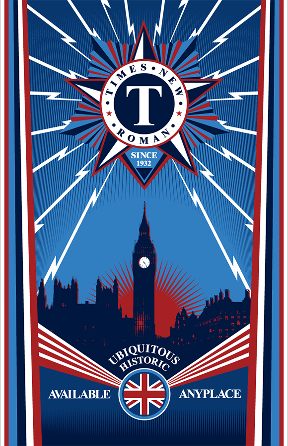
This poster was part one of a two-part project for which I did historical research on the font, Times New Roman. Turns out the font has an interesting history starting back in 1929 when the London newspaper The Times hired typographer Stanley Morison of Monotype to create a new text font for the paper. At the time, there were a ton of propaganda posters about.

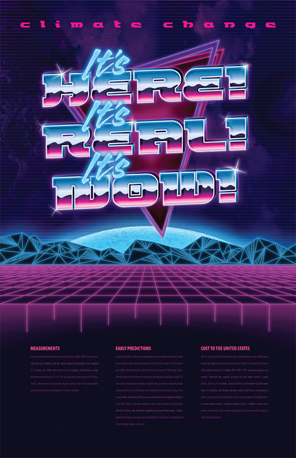
I love the 80’s retro style of this design for Green Patriot posters. The real point here is to grab a person’s attention and make them want to stop walking down the hall and read the information on the bottom of the poster, instead of passing it by without a second glance. I did a lot of visual research to make sure I nailed the style.