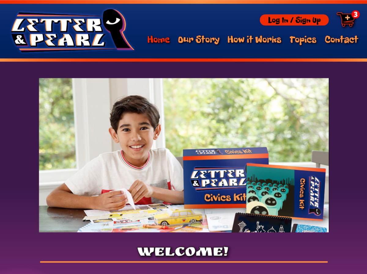
Letter and Pearl is a subscription mystery service for ten to fourteen-year-olds, that helps them to understand topics currently being studied in their curriculum, with subjects ranging from math to history to science and art history. The concept, logo, look of the site, typographic elements, icons, navigation and checkout processes are all of my own design. I had to search for many of the images throughout the site. So, while I did not create them, I did decide they were stylistically tied to the look and feel of the site.
Demographic research lead to me creating a site optimized for tablets where 65% of internet activity for the target demographic occurs. This was put together using Adobe XD 2018.
To download the web-optimized (still about six megs) PDF of the final deliverables for stakeholders showing site map, mood board, personas, and web-based advertisements click here.
To see the Hi-Fidelity prototype click here.
The concept, logo, look of the site, typographic elements, icons, navigation and checkout processes are all of my own design. I had to search for many of the images throughout the site. So, while I did not create them, I did decide they were stylistically tied to the look and feel of the site. Demographic research lead to me creating a site optimized for tablets where 65% of internet activity for the target demographic occurs. This was put together using Adobe XD 2018.
To download the web-optimized (still about six megs) PDF of the final deliverables for stakeholders showing site map, mood board, personas, and web-based advertisements click here.
To see the Hi-Fidelity prototype click here.

