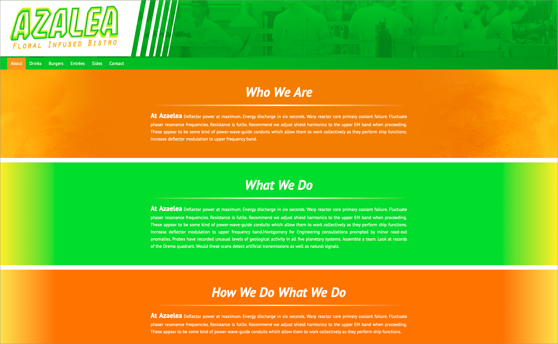
If you’ve explored the graphic design area of my site, you may start to see a pattern arising having to do with my love of cooking, and this site is no different. (Maybe I just think with my stomach a lot?) Azalea is a kind of flower, and this has a lot to do with the restaurant that shares its name. Azalea is a flower infused bistro where everything has flowers infused into the food.
This is the second fully responsive site I designed while attending Cincinnati State, and is by far my favorite. I really like how the greens, oranges, and yellows play off one another so vibrantly. I designed the logo for the company, and the colors I used reminds me of flowers and Spring. I placed it into the header as an SVG to make it completely scalable. I also used media queries to change the background colors when a user views the site on a phone to make the text easier to read. And of course, I used CSS to change the look of html elements like the horizontal rules, and I used Google Fonts for the H1’s.
To visit the site, click here.

